Our world is a pretty complex place. With so many unknowns within our own counties, let alone among the billions of universes we’ve yet to discover, it’s nice to have a little explanation of our world’s many social intricacies every now and then. The Washington Post has done exactly that. Featuring 40 handy maps that help to explain all the things you always wondered about the world, here are some of their best.
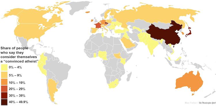
In a bid to find out where religion still maintains great influence over people, research body Gallup collated enough details to pinpoint where religion has lost its grip and faith in God has been supplanted by an adamant belief in nothing. Japan and China are by far the most atheistic countries, with a staggering 47% of those surveyed in China saying that they do not believe in God. At the other end, almost 75% of Italians consider themselves religious. Perhaps their proximity to the Pope has something to do with this rather high percentage of believers.
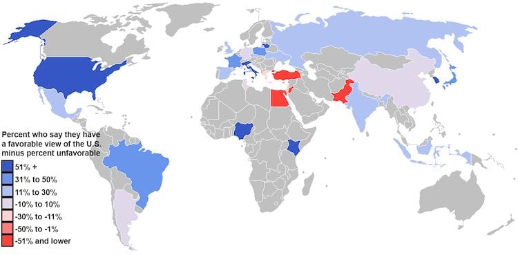
As part of a global attitudes survey, the Pew Research Center took the world’s temperature on how favorably countries view the United States of America. The more positive responses appear in blue, the least favorable opinions are in blaring red, and grey is no response. Taken in 2012, the U.S. ranks highest with the European continent and in sub-Saharan Africa. For their parts, Egypt, Turkey and Pakistan favorthe States the least.
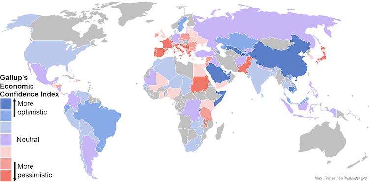
In spite of hard data that might suggest otherwise, people tend to have their own ideas about how their economies are doing, employing optimism as an oft-distorting evaluation device. In a survey which measures people’s perceptions of their country’s economy stability, the U.S. places second in optimism within the developed world. Sweden takes the top spot, and many of those southern European countries in the throes of austerity measures are the most pessimistic.

Given the multitude of ways religions, cultures and the state approaches homosexuality, it’s understandable that opinion on the subject varies dramatically around the world. Pew Research Center’s survey showed that sub-Saharan Africa and Muslim-majority countries ranked as the “least accepting” of homosexuality, while Latin American and Western countries appeared to be the most accepting. How those sentiments manifest themselves in legislation, however, is another matter entirely.
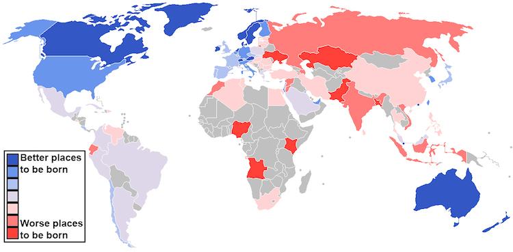
Taking into account life satisfaction, the state of the economy, human rights adherence and health standards among other factors, the map of best places to be born makes for some interesting reading. Nordic countries with high life expectancies top the list with Australia, New Zealand and Ireland coming in at a close second. At the other end of the spectrum, countries with more violence and governmental oppression rank lowest, with Nigeria, Kenya and Ukraine listed among the worst.
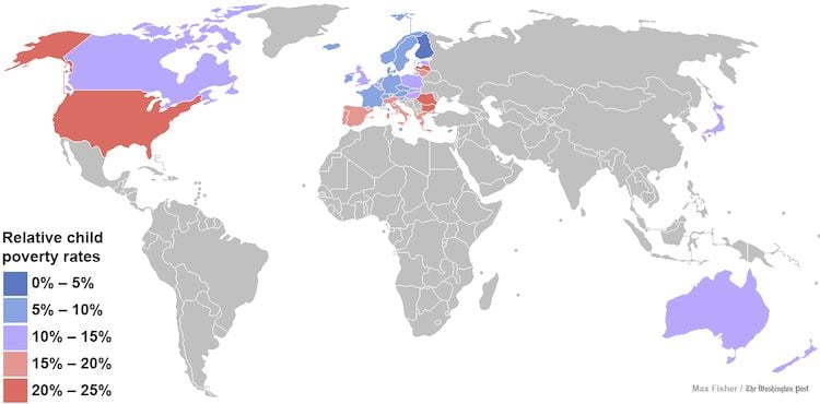
Child poverty in the developed world is an increasing issue, and a survey conducted in 35 of the world’s developed countries demonstrated some surprising results. Yet again, Nordic countries came out more favorably as its small size and ample welfare state have handled the incidence of child poverty well. The United States, however, was ranked 34th, which was only slightly ahead of Romania in last place. As it stands, 16 million children (22% of all children) in the United States are part of families whose incomes are below the federal poverty level.
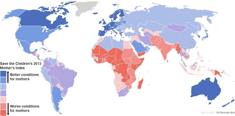
Based on infant mortality rates, national income and the average number of years a child spends in education, researchers at the Save the Children Foundation have plotted the best and worst countries to be a mother. Mirroring the survey of the best places to be born, the Nordic countries come in top again. As it stands, many Nordic countries offer generous parental leave and public daycare options to new parents. However, you wouldn’t want to be a mother in sub-Saharan Africa or South Asia.
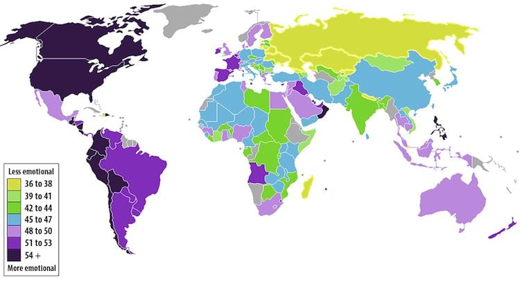
It’s a long standing stereotype that Brits keep a stiff upper lip on sentimental affairs, but has anyone ever measured just how emotional each country is? The answer is, in fact, yes. On this map that plots the most emotional countries in the world, the rocky island appears relatively more emotional than previously imagined. Perhaps the icy permafrost that blankets Russian soil contributes to its stoic demeanor.
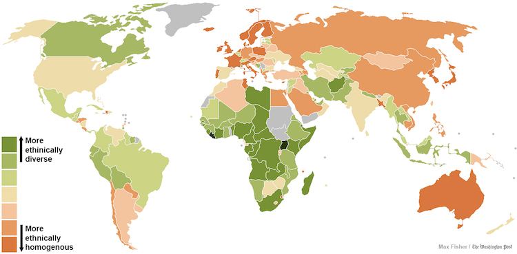
Showing the world’s most ethnically diverse countries, there appears to be a rather visible split in the map. In particular, the old continent of Europe is more ethnically homogenous, as sub-Saharan Africa is the most ethnically diverse region in the world. Compared alongside the racial tolerance map, the data is rather revealing about our attitudes to our global neighbors.
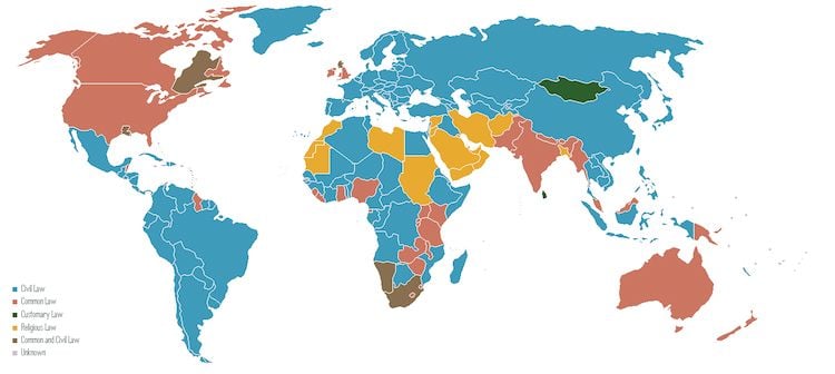
In a less statistics-based map, the Washington Post has researched the different legal systems that we use to govern our world, and have marked them rather handily on a map. While some countries are still governed by religious doctrines, a good majority of countries rule themselves by civil law. Interestingly, the British colonial Common Law system, once unique, can now be found on every continent.
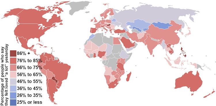
The language of love is something which translates all the way across the world, but apparently there’s less of it present in certain countries. When asked “Did you experience love for a lot of the day yesterday?”, those in red answered “yes”, with a rather blue few answering “no”. Of course, the question is fraught with issues (different cultures ‘experience’ love in different ways, and others are more reticent when posed with questions of an intimate nature), but the results are still rather interesting. As a region, Latin America was the most amorous. Several former Soviet republics, it would seem, didn’t feel the love quite as much.
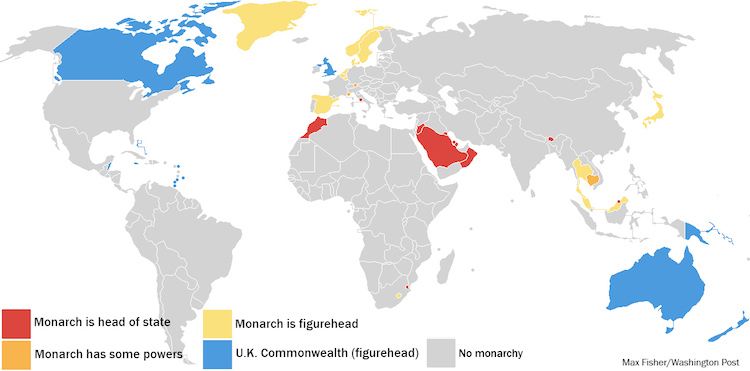
Most of us are likely more familiar with the British Royal Family than we’d really like to be, but just how many of the world’s monarchies remain? With only 26 royal families left, less than half are in a position to wield substantive power. Nowadays, many royal titles are honorary or ceremonial. Interestingly enough, the Pope is known as the monarch of the Vatican, and he does in fact possess the power to rule the European city-state.
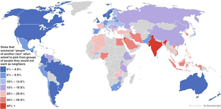
Racial tolerance is a hotly debated topic the world over, and the people behind the World Values Survey have attempted to chart which countries’ constituents are more open to living next door to someone of a different race. Of course, it’s difficult to gauge a universal definition of ‘tolerance’ and how to quantify it, so the Washington Post brought in an ethnic conflict specialist to try and interpret the map.
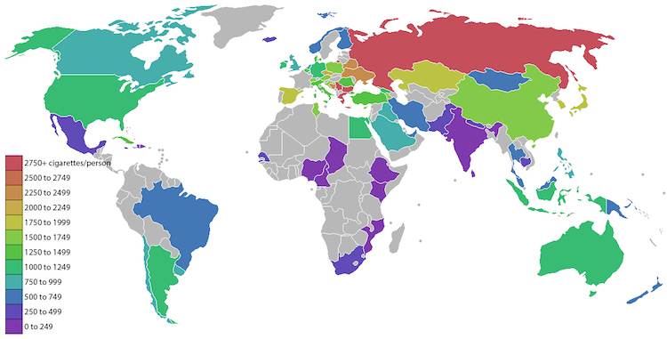
It’s common knowledge that smoking takes a dramatic toll on human health, but even with this in mind, there are still thousands who light up several times a day, every day. On the world map, Russia by far boasts the biggest smoking problem. Each year, smoking claims the lives of 400,000 people and costs the country a staggering $48.1 billion in smoking-related health expenses. At the other end, South Asia has some of the lowest smoking rates in the world, with the United States sitting slap bang in the middle of the spectrum.
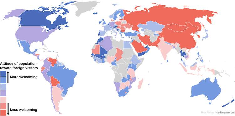
The first thing that pops into your head when kicking off a vacation might not be “I wonder how welcoming the locals are to tourists”. But if that is something that keeps you up at night, then you might consider visiting New Zealand, Iceland or Morocco, having taken the map’s top three spots of countries most welcoming to foreigners.
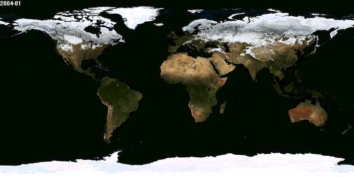
NASA gives a bit of dynamism to the standard map in its ‘Blue Marble’ project. A series of images recorded by high tech space satellites, “Blue Marble” shows how earthly seasons and weather patterns change over the course of a year.
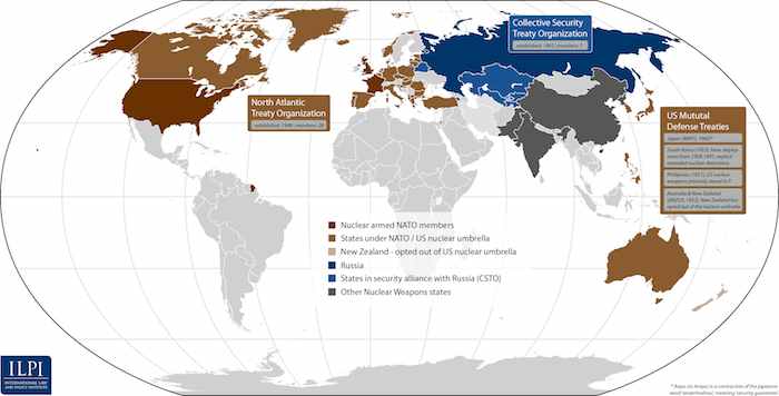
While the Cold War officially ended in 1991 following the collapse of the USSR, that epoch was key in establishing global nuclear powers that are sure to be around for the foreseeable future. Decades later, thousands of the warheads are still here and only growing in number.
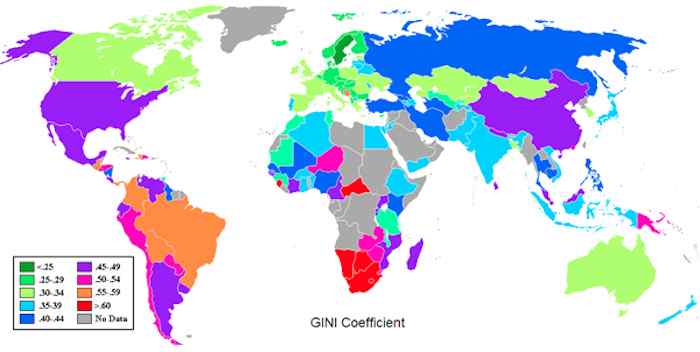
To complement the map featuring individual perceptions of national economies, here’s one that’s based a bit more in the quantitative realm. By plotting each country’s ‘GINI coefficient, the age-old formula that measures the equality of national economies on a scale of 0 to 1 (‘1’ being complete inequality), it’s possible to see where true economic inequality lies. Looking at the United States’ position, it’s fair to make the assessment that great wealth generation can often come with great economic inequality.
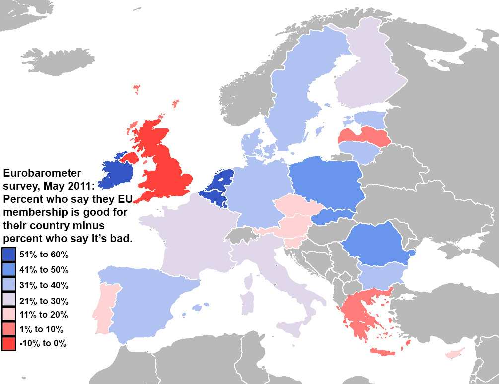
Negative attitudes toward the European Union have been calming over the last few years, but the figures feature here are present a European Union that’s cooling down at a slower rate than originally though. More people in the UK believe that the EU is bad for their country. Echoing the sentiments--or perhaps guiding them--of the UK, Prime Minister David Cameron has promised a referendum in five years to determine whether the country should remain an EU member.
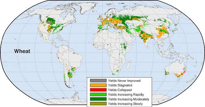
Unless you’re an ecologist, you may not be aware of the changing state of our world’s crops. So why should you care? Well, without them we’d lose a vital source of not only energy, but the collapse of crops could be disastrous for the world’s economy. In a study by the University of Minnesota, some of the world’s major crop regions are slowly stagnating due to increasingly volatile and dramatic weather patterns. It’s difficult to say how far into the future a real crisis might be and how much damage it might cause, but researchers believe that if we “sound the alert” quickly enough, a reversal in course might be attainable.
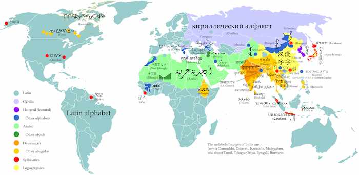
Given how many writing systems today are based in Latin, this map demonstrates just how far--and longlasting--of a reach European colonial powers have had on the world.
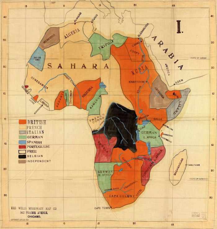
Africa began its harrowingly protracted relationship with European colonial powers at the dawn of the 20th century. In their eyes, Africa was little more than a pie that should be divided and indulged in at whatever cost. This map, belonging to a European missionary, demonstrates the remarkable drawing of borders, and just how many gluttonous powers were fighting for a bigger, more profitable slice. Along with the European inventions of indigenous “traditions” to divide the colonized populations and prevent them from rebelling against colonial powers, these “diverse communities forced together” have greatly contributed to the ceaseless conflicts that shape the continent’s modern history.
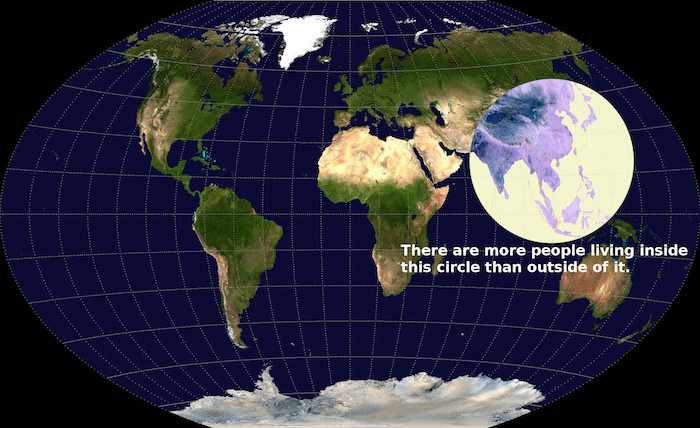
To borrow from Thomas Friedman, the internet has helped bring a lot of the world closer together, but when you look at this map, some of us are already a lot closer than we think. Currently, China and India’s skyrocketing populations contribute to a total of 3,637,830,357 bodies, or a whopping 51.4% of the world’s entire population.
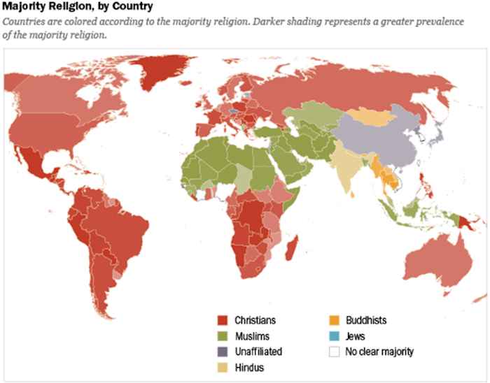
Partnered with language, another relic of European colonial influence is religion. A staggering 31.5% of the globe identify as Christians, with its worshippers comprising almost all of the Western hemisphere.
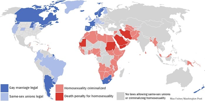
Another contentious subject matter, attitudes toward homosexuality vary dramatically around the world. With gay marriage slowly being legalized throughout many countries, it’s an entirely different story in other parts of the world. The results of Pew Research Center’s survey suggest that sub-Saharan Africa and Muslim-majority countries are the least accepting of homosexuality, while Latin American and Western countries appeared--at least in their survey responses--to be the most accepting.
And if you enjoyed these maps that explain the world, be sure to see 30 GIFs that explain the world and our amazing collection of interesting facts!